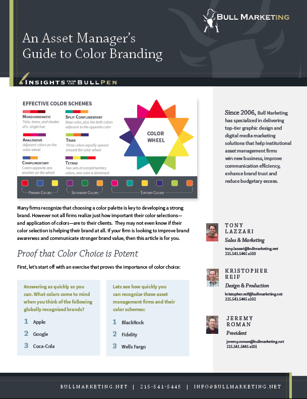
 Many firms recognize that choosing a color palette is key to developing a strong brand. However not all firms realize just how important their color selections—and application of colors—are to their clients. They may not even know if their color selection is helping their brand at all. If your firm is looking to improve brand awareness and communicate stronger brand value, then this article is for you.
First, let’s start off with an exercise that proves the importance of color choice:
How many did you get correct? Chances are, most readers were able to shout out the brand colors before they were even finished reading the firm name. Now lets swing the focus around to your brand. If your clients were asked the same question, would their answer be on the tip of their tongue? If your answer is no, it may be time to consider challenging your brand colors.
There are plenty of thought pieces that go into the deeper symbolic meaning behind each color. Since that topic is so well documented, I encourage anyone interested in learning more about color meaning to conduct a web search for “color psychology”, you will find plenty of actionable information. I avoid going too deep into that topic here because the purpose of this article is to focus on what colors asset management firms are using and which colors are most in harmony in today’s market.
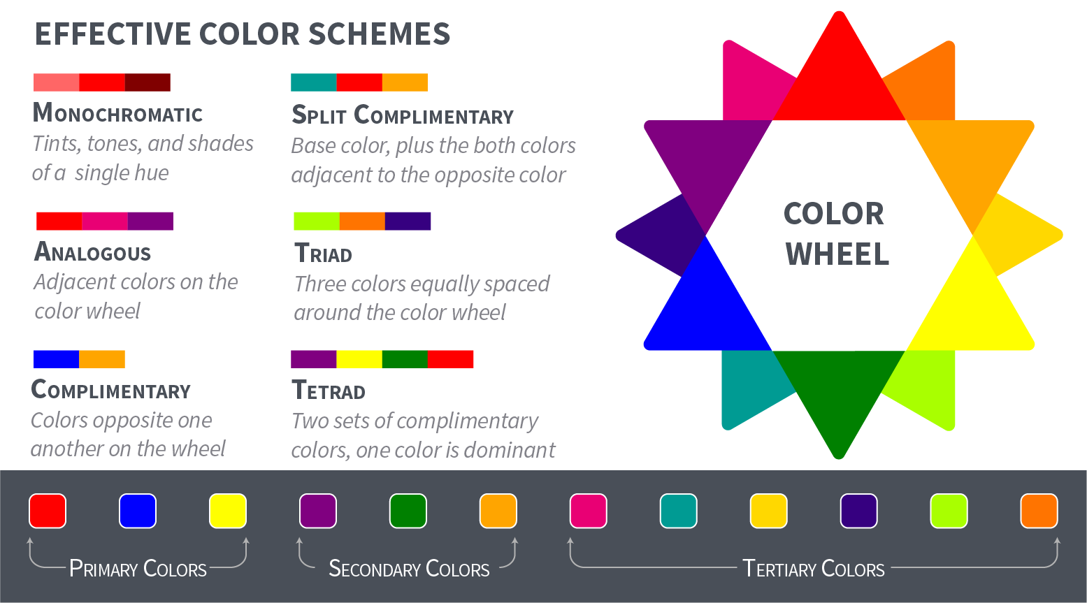
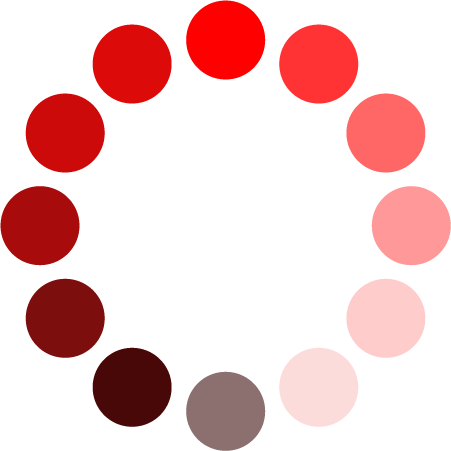 Monochromatic color palettes create a mood of focus and foundation. One dominant color is accented by varying values of that same color hue. Whichever color is selected to represent the brand value, is empowered to shine through untethered of contrast from any other color value.
 An analogous color scheme is best used to accent a particular color temperature that expresses the desired mood. Violets, blues, and greens create cool moods; and reds, oranges, and yellows create warmer settings for your brand. While analogous colors harmonize nicely with one another, the end pieces tend to lack the vibrance and contrast of complementary color palettes.
 A complementary color scheme makes use of colors that naturally contrast each other. Complimentary schemes tend to be the most vibrant, which can really help a brand stand out in a crowded market.
 Like complimentary colors, triadic color palettes create a vibrant mood, but they bring a stronger feeling of balance between color values because the colors are evenly spaced apart on the color wheel, where as compliments are in opposition.
 A tetradic color palette makes use of two sets of complimentary colors. In branding, it is key to declare a dominant color out of the four, otherwise, the color scheme may create a mood of disharmony. However, if the colors are applied appropriately, tetradic color palettes can create the most excitement out of all of the color schemes.
 A split complimentary color scheme also creates a strong contrast and vibrant feel just like a complimentary color scheme, but because it uses colors that neighbor the dominant color’s opposition, the overall feeling is a little softer than a complimentary palette while still creating a vivacious mood.
To learn more we decided to conduct a case study that looked at twenty of the more modern asset management websites to learn how they are using color. The results we found taught us two things: which color schemes were employed the most and which colors were used most often among asset management firms.
 The results in Figure 1 shows what color schemes are most popular in 2016. Monochromatic color schemes dominate the landscape making up over 30% of the results. Second place is a tie between analogous, and complimentary color schemes coming in at 20%. 15% of the firms surveyed made use of color triads, 10% were bold enough to deliver tetrad colors, and 5% of firms were adventurous enough to design using split complimentary colors. Let’s take a closer look at what type of mood each different color scheme creates to learn more.
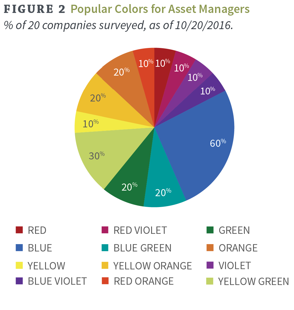 Figure 2 shows which colors were most often used among modern asset management sites. As most may have presumed, blue leads the pack and green comes in second. And at first glance, orange might seem to be a surprise coming in at third place, but when one considers that orange is a perfect compliment to the most popular color blue, that result makes a lot of sense. Complimentary color schemes do make up 20% of the websites included in this case study.
Remember, you will need color for more than just your firm’s logo. That means, whichever colors are selected also need to harmonize with your accent colors. For instance, what if your firm is branded using black and red, and you roll out a new product offering that requires it’s own website? Wouldn’t it make sense to brand that product site in a way that defines the product itself as it’s own brand, but at the same time ensuring that the new color palette compliments the primary brand color palette?
Another great example is when you develop the color scheme for your branded graphics such as charts, tables and infographics. If your color scheme only includes 4 colors, and your firm decides to publish a chart that requires ten unique line colors, be sure to select a deep enough color palette. Make sure the colors you select are a good compliment to one another, and make sure that they aren’t too close in hue where they run the risk of blending in with the other colors in your color palette.
Color branding, and understanding the depths of how color effects a consumer’s experience, is a robust topic. It’s comparable to learning a language because of it’s potent ability to communicate value and create excitement without using any words. However, the time invested in selecting the right colors is invaluable.
© 2016 Bull Marketing, Inc. All Rights Reserved.