In the past, it was common for investment firms to drop data into Microsoft PowerPoint or Excel and have a chart ready for publication in seconds, but that’s not good enough in the competitive environment we find ourselves in today. Investment marketers are being tasked harder than ever to find ways to set themselves apart from other firms. Delivering memorable, high-quality branded graphics is an excellent way to stand out without breaking the budget.
Because the eye is naturally drawn to the most visually dominant elements on a page, one of the first things an audience will notice about a publication is its graphics. Image quality is critical when communicating value to clients because images are interpreted and remembered by the mind more easily than words alone. Think about it, if you were going to select a new book, wouldn’t you prefer a book with a visually appealing cover that sells the story? Many would, and that’s all the more reason to look at your audience’s experience in a similar fashion. A smartly designed graphic directs the client’s eye, highlights value in a logical and thought-provoking way and sets your communication apart from the pack.
In the following pages, we take a closer look at common issues that arise with everyday chart generators and why their default output no longer fits the bill. We also share a few challenging examples we’ve encountered that took a little extra creativity to solve. As you read, consider what your images are communicating. Are your readers being visually directed through the message, or are key points overlooked because the visuals can’t be deciphered? Are your thought pieces being shared in droves across social networks? If the answer is no, it may be time to re-evaluate the role your graphics are playing.
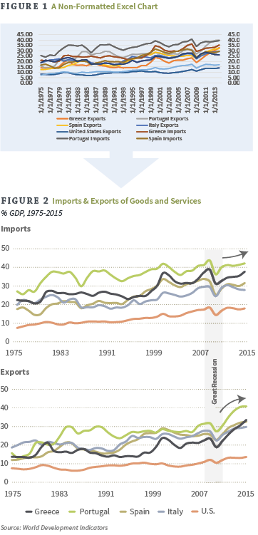
Dumping data into chart generators like Microsoft Excel can produce rough formatting side effects that might weigh down the flow of an otherwise strong marketing communication. In Figure 1, we ran the sample dataset of Imports and Exports of Goods and Services from 1975-2015 (as % of GDP) through Excel’s default chart generator. The resulting graphic displays the data, but it’s not very clear and creates an air of disorganization. The creativity really begins where the chart builders leave off. To bring out the hidden beauty in the chart, look for ways to simplify for a cleaner presentation. Take a look at some of the techniques we applied to bring the same data to life in Figure 2:
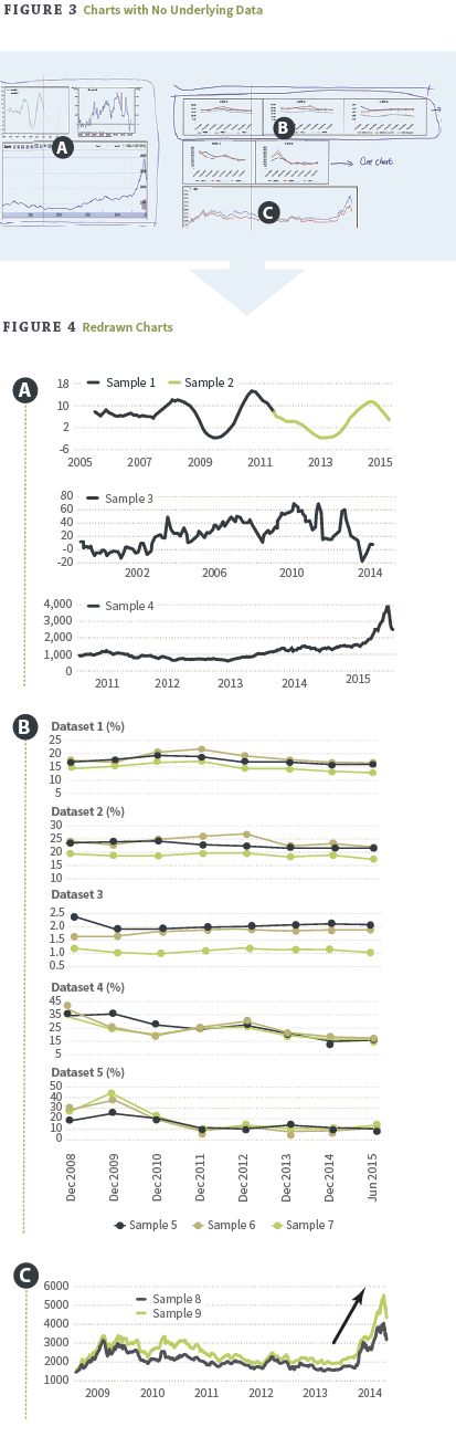
A common issue that arises when designing a publication is coming across a chart you would like to include that has no underlying dataset. It goes without saying that unbranded, unformatted, low-quality images can never be used as is, but luckily they can be redrawn with a little design expertise. Figure 3 shows rough charts with no dataset and Figure 4 shows the end results after our proprietary redrawing process has been applied.
Standardizing all visual elements for consistency is key in delivering a memorable message. In other words, there should be a flow of graphical continuity throughout the entirety of the document. Oftentimes charts are created as the data is received to give a working visual reference to the author. Over time, data is received and charts continue to be compiled in the same ad-hoc fashion. Unfortunately presenting the charts in this raw form isn’t an option when the goal is to draw in the reader, so the challenge becomes finding a way to solidify continuity by enhancing the design.
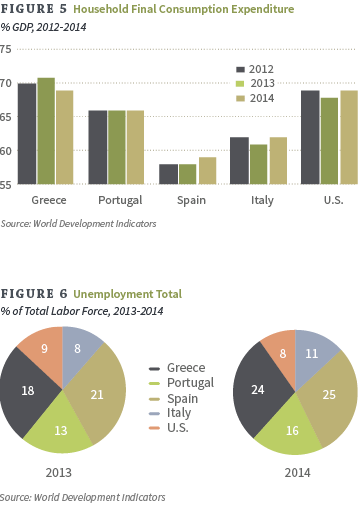
As we see in Figure 5 and Figure 6, both charts follow the same visual construct and proportions. Series colors, font-styling and line thickness all help carry a clean visual flow from figure to figure. Even the choice to use the % symbol in place of percent in written form must remain consistent throughout your materials for the best effect. Visual consistency makes for an easier reading experience. If your communications are easy to comprehend, your message will be remembered and your value will stand out.
To stay on pace with today’s demands, asset management firms are moving forward with more of a holistic approach to designing communications. They are revisiting old layouts that are no longer working and fortifying them with graphics that clearly and quickly tell the story through images. Below is a list of comprehensive questions that can serve as a great starting point in determining if your communications are hitting their targets.
As you can see, there are many benefits to be uncovered by enhancing your communications with branded charts and graphs. Do you think it may be time for an overhaul? If you need an extra set of hands in the creativity department, we invite you to give us a call for a free consultation. Bull Marketing has been helping asset managers and their organizations address new revenue streams and retain client relationships since 2006, and our path to success is repeatable. In fact, here are a few quotes from our clients about their experience working with us:
Bull Marketing works on many sensitive projects dealing in compliance and confidential information. All works shown are used with permission and not restricted under NDA. Charts are only intended to be viewed as visual graphical examples in which the data shown cannot be guaranteed accurate.
© 2015 Bull Marketing, Inc. All Rights Reserved.
|
An Asset Manager's Guide to Selecting a Color Palette
|
|
An Asset Manager’s Guide to Selecting an Appropriate Video Length
|
|
An Asset Manager's Guide to Improving User Experience
|
|
An Asset Manager's Guide to Developing Video Presentations
|

|
Responsive Websites: A Priority for SEO and User Experience
|
|
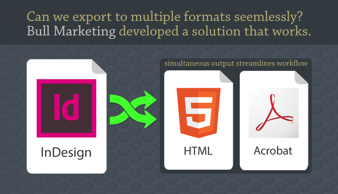
InDesign Customized to Export Multiple, Simultaneous Formats
|
215.541.5445
info@bullmarketing.net
P.O. Box 408
Trumbauersville, PA 18970
©2025 Bull Marketing, Inc. All Rights Reserved