
 Since 2013 Responsive web design has be a major topic of discussion. "Do we implement a Responsive Design, or do we design a desktop and mobile site?" seems to be the re-occurring question in every marketing discussion worldwide. One of the corner stone best practices of modern Search Engine Optimization (SEO) is to maintain a mobile website, so the advantageous are joining the foray. I would like to weigh in on the growing debate:
I don’t expect you to take my word for it either.
Just ask Google: “Google recommends webmasters follow the industry best practice of using responsive web design, namely serving the same HTML for all devices and using only CSS media queries to decide the rendering on each device.” – Google

Bing and Yahoo also agree. In fact, now that the search engines have given their recommendation, the question of "should we, or shouldn't we implement a responsive website?" can finally be laid to rest. The search engines love it and it saves you time and money all while giving your users a better experience. There is no longer a question as to whether or not it will take off, because it has. Now it's more of a question of where it will evolve to next and are you ready to adapt?
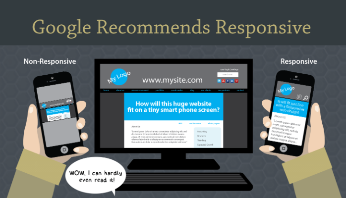
Up until the last few years, the best way to achieve this was to design, maintain and collect analytic data from two separate sites; one dedicated to mobile users and one dedicated to desktop users. Of course, maintaining various versions of the same site is time consuming and does not organize a web site in an optimal way for search engines to index it. If they can’t index easily, rankings suffer, plain and simple. Responsive websites address this for the search engines by centralizing content all under one convenient URL. If you make their job easier, your site gets a higher ranking as a result.
Even beyond the obvious SEO benefits, Responsive layouts greatly improve the user experience in all cases. It doesn't matter if you are viewing a website from an HD television, or a small phone, you will be able to clearly read the text, and easily follow the navigation because it will be specifically organized for the best possible output on the device you are viewing from. No more pinching, scrolling and re-sizing your screen and causing your users to wrestle with their devices so that they can clearly receive your message.
If your web initiatives include; SEO, optimal user interface and experience, trending analytics, brand continuity, improving click conversions, incorporating more third party back-end solutions such as Salesforce, Twitter or LinkedIn, streamline maintenance and improving ROI, then a Responsive Website is a MUST to implement.
 Websites
|
An Asset Manager’s Guide to Leveraging Branded Charts & Graphics
|
|
An Asset Manager's Guide to Selecting a Color Palette
|
|
An Asset Manager’s Guide to Selecting an Appropriate Video Length
|
|
An Asset Manager's Guide to Improving User Experience
|
|
An Asset Manager's Guide to Developing Video Presentations
|

|
InDesign Customized to Export Multiple, Simultaneous Formats
|
215.541.5445
info@bullmarketing.net
P.O. Box 408
Trumbauersville, PA 18970
©2025 Bull Marketing, Inc. All Rights Reserved
