 When was the last time you walked through one of your white papers, or browsed your firm’s website and considered what a client or prospect might think about how they appear? If your answer is recently, then you are ahead of the pack. Unfortunately most firms are slow to adapt and oftentimes are a few steps behind other industries when it comes to aesthetics and overall “user experience”.
Asset management firms tend to put most of their energy into crafting the message itself, attempting to assure each reader develops an understanding of the firm’s core values. But in today’s web driven world, user experience factors in just as much as value statements. In fact, if a user can’t find what they are looking for on your site, can’t figure out how to work the navigation, or are forced to read too much, they will leave without learning about the firm. Bull Marketing is here to make sure that core value doesn’t go un-noticed, and that starts with helping our clients improve their user experience.

A good user experience is not exclusive to websites either, it’s a core component of marketing to the “On Demand” generation. Your firm’s whitepapers, factsheets, videos, and pitchbooks all need regular re-appraisal to determine if they are in line with a good user experience, otherwise they run the risk of being ineffective. Example A shows a list of things an investment firm would like their users to know about, Example B shows the thoughts that goes through the user’s head as they search for that information on the website.
 Example A
 Example B
Notice how the user’s entire thought process was consumed with how to navigate the website, rather than spending that energy to understand your firm’s value? If your user’s experience isn’t on par with their expectation, you run the risk of losing their attention. Step one is to figure out what your users are expecting. After you establish that, then you can customize the experience around those expectations.
Let’s get more specific about the types of marketing collateral your firm is using. Here are some targeted questions that are designed to draw attention to your user experience and uncover areas to improve upon. Ask yourself these questions to start to think along the lines of your users, but in addition to that, ask your clients these questions if you conduct a regular satisfaction survey. The will tell you exactly how your message is being viewed outside of your firm.


Oftentimes marketing initiatives start out being in sync with the user’s goals, but they have a tendency to slip out of rhythm as time goes on and design trends change. To avoid slumps like this, it’s best to refresh marketing materials as often as the demand changes. That means it pays to play the devil’s advocate once in a while and ask if your firm is creating an experience that is good for your audience. If you aren’t sure, a good way to tell is to check out what your competitors are doing. If their materials look nicer, have a clearer message, and support their overall brand better, your users will eventually notice, and you can’t let that happen.
The ability to re-appraise things is necessary, even though it is a strenuous task for a firm of any size. It pings on pride and can be a tougher sell to upper management because the return on investment isn’t always immediately tangible. However, it beats realizing after the fact that the experience is not up to snuff. It's far more cost-effective to proactively challenge you brand, regardless of what has worked well in the past. In fact, I think Rear Admiral Grace Hopper put it best when she insinuated:
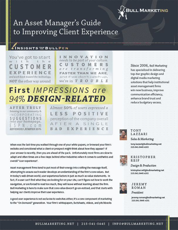
Feature image references: Quotes start in the top left of the image and run clockwise towards the center.
1 “You’ve got to start with the customer experience and work back toward the technology, not the other way around.” —Steve Jobs
2 “Innovation needs to be part of your culture. Customers are transforming faster than we are, and if we don’t catch up, we’re in trouble.” —Ian Schafer
3 “Almost 50% of users expressed a less positive perception of the company overall after a single bad experience.” —2010 Gomez Report
4 “After truly listening to our community and incorporating suggestions into our homepage, ESPN.com revenues jumped 35%” —John Kosner ESPN.com
5 “First impressions are 94% design-related.” —Trust and Mistrust of Online Health Sites, by Elizabeth Sillence, Pam Briggs, Lesley Fishwich, and Peter Harris
© 2016 Bull Marketing, Inc. All Rights Reserved.